


Weekly Design Roundup – Dima Srouji's glassware, artist-drawn wine labels, and a slice of Swedish design history
🌀🌀🌀 Instagram reel inspiration falling thick and fast this week


Back to our regularly scheduled programming …⋆ .𖥔˚Weekly Design Roundup˚𖥔. ⋆
꩜꩜꩜ This email is likely too long to read in your inbox - open the post in a web browser to read the entire thing!
I took a week off last week after coming back from Estonia and quickly succumbing to the glories of Spring here in London. Daily blue skies and near-20º-temperature have meant (sadly? happily?) less time spent indoors ruminating about design. But only slightly less, as this week was a shockingly good Instagram-inspiration week. Many a reel was manically saved and sent to myself via DM but alas only four have made the cut below. Vote for your favourite ahead of next week’s episode lest they be voted off the island…
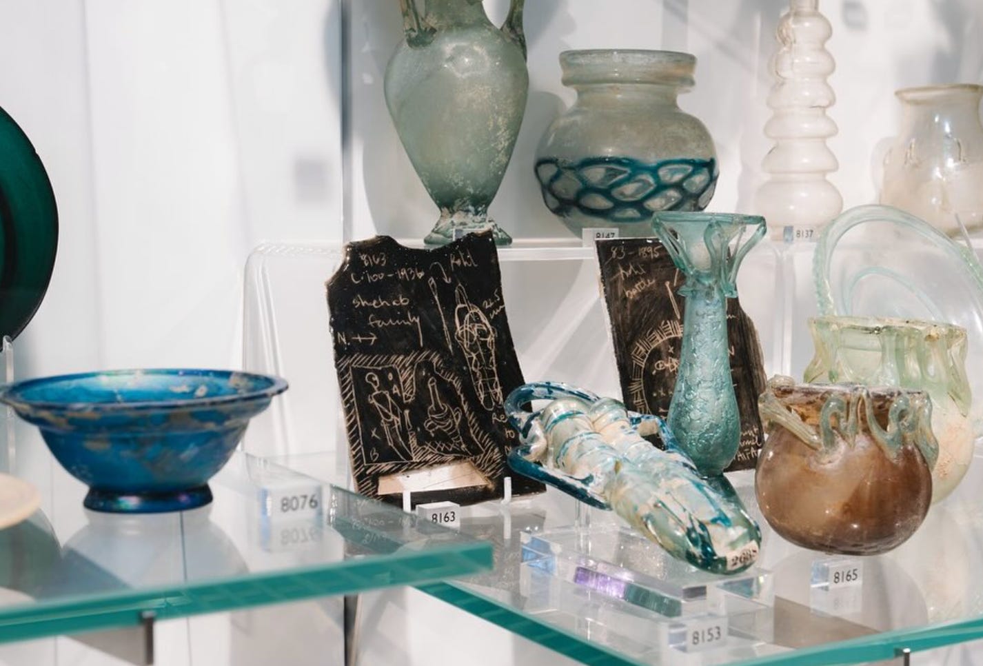
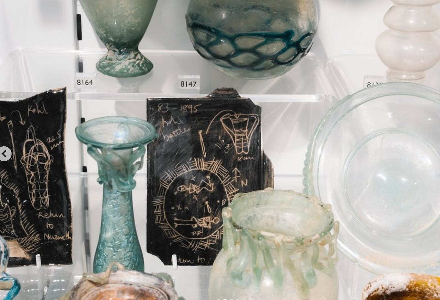
Dima Srouji's Palestinian crafted glassware
Dima Srouji is a Palestinian architect and artist and founder of Hollow Forms Studio. Her work is concerned with politics and place - more specifically “the ground, objects, displacement, restitution, forgeries, and living archives.”


Two pieces of Srouji’s practice resonated deeply with me after stumbling onto her work on Instagram - her glass-blowing studio Hollow Forms and the exploration of archaeological materials in her archival work.

First - Hollow Forms. Srouji founded Hollow Forms, a glass blowing project with the Twam family in Jaba’, Palestine in 2016. The reel below explains how Hollow Forms emerged:
“After graduate school, Dima Srouji was interested in exploring a closer dynamic between land and architecture. She was working in historical village presevation for Riwaq (Centre for Architectural Conservation) when she met the Twam family.

The glassware produced by Hollow Forms is inspired by the archaeological past - and by deeply rooted history of craft in Palestine. I adore the bold colours, abstract forms, and decorative details that adorn the pieces.


In her personal work, Srouji has explored glassware, the black market, Palestinian displacement, and the ethics of archaeological excavation in a recently curated mini exhibition for the V&A museum. As Srouji describes:
If you’re in London, go see her work in person at the V&A and, as always, free Palestine.
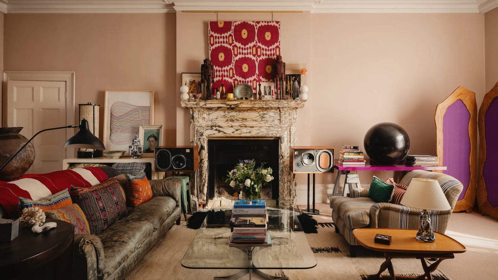
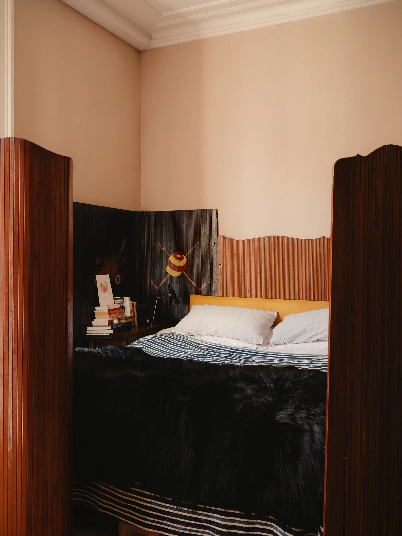
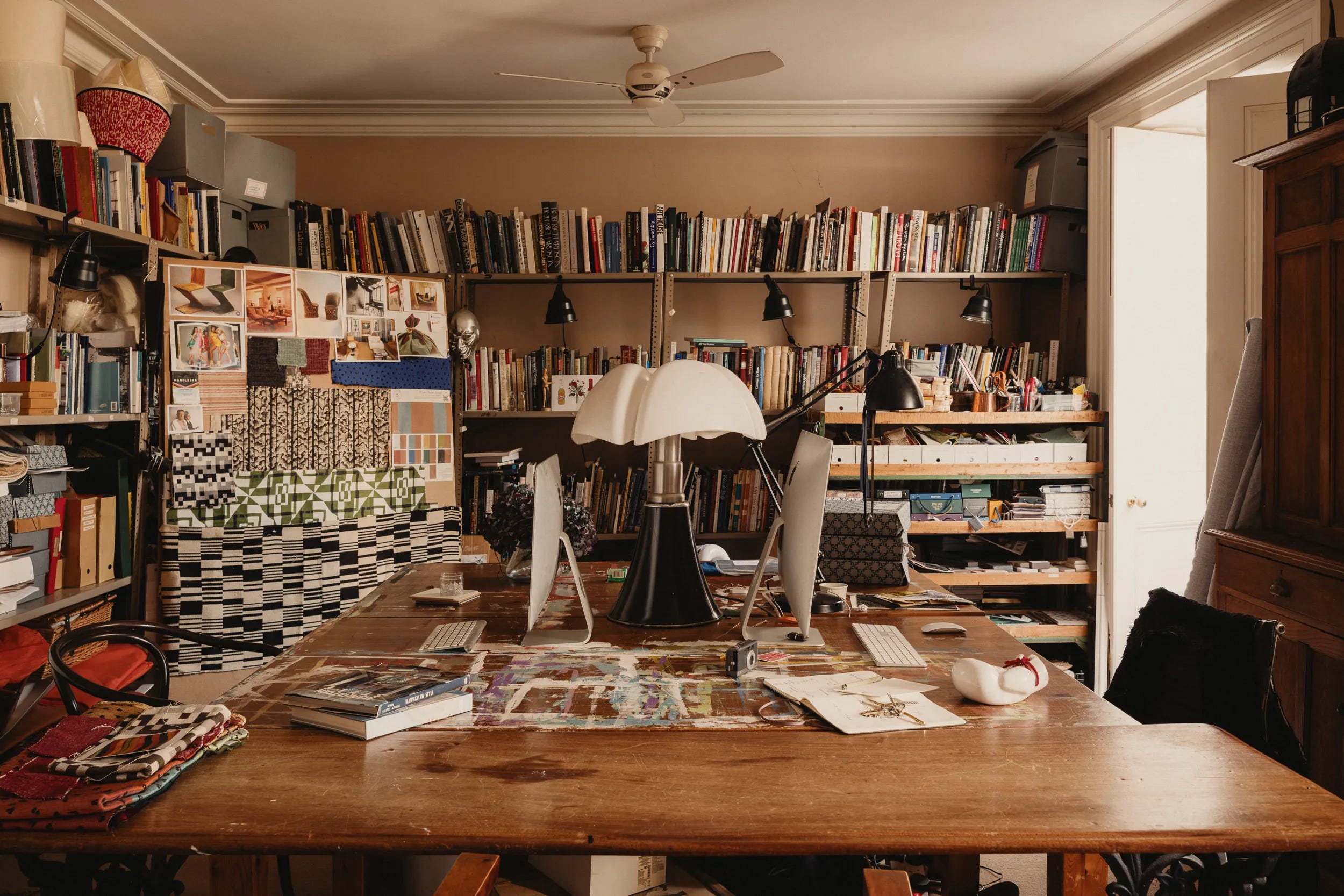
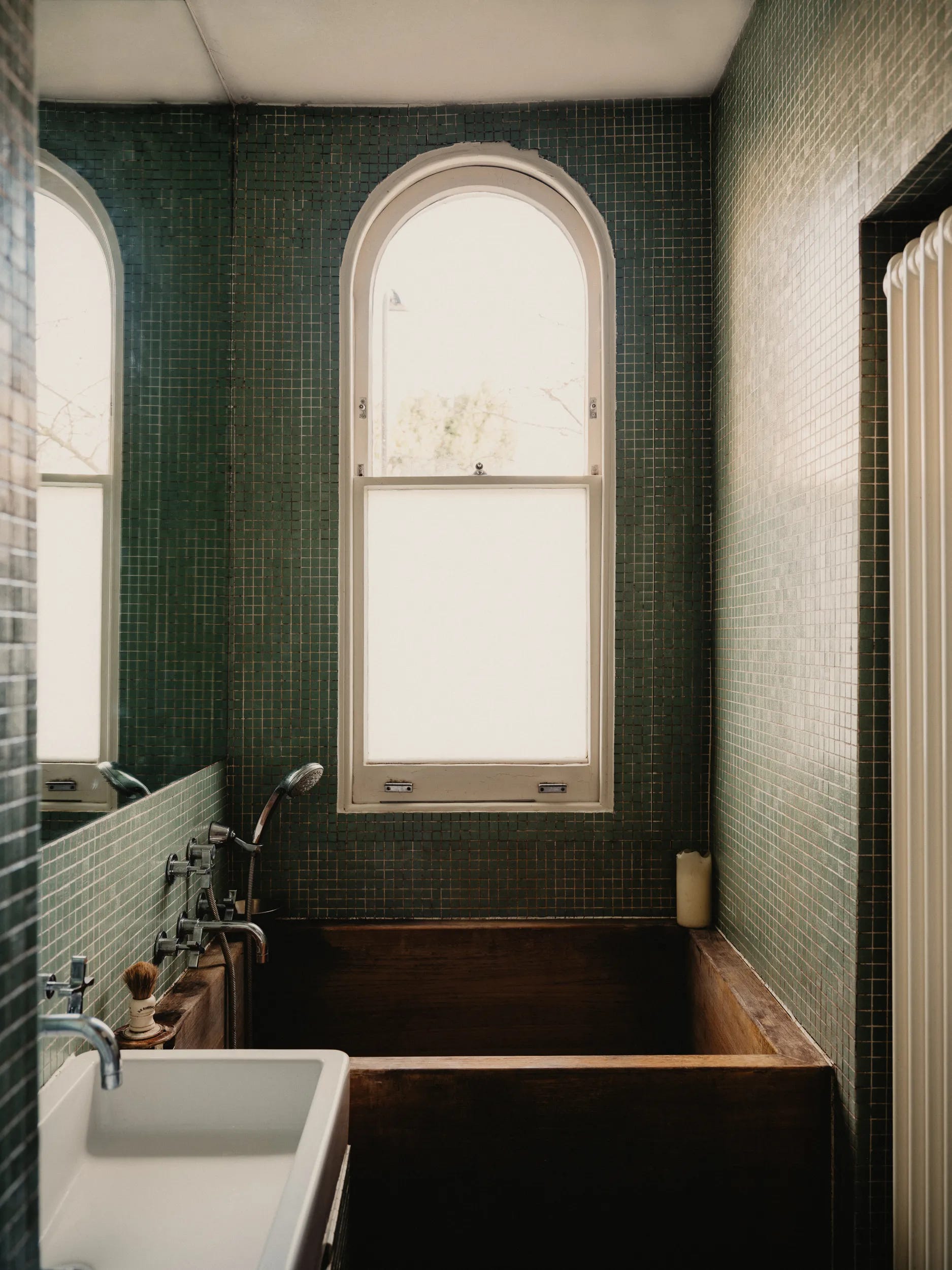
Next up, Adam Bray’s incredible antiques-filled home
Adam Bray is an interior designer and antiques dealer who’s chaotically gorgeous Maida Vale home was recently featured in House and Garden. The below reel caught me hook, line and sinker from the first sentence in which Bray says:
“I like Italian mid-century lighting, I like 20th-century decorative arts, that is sort of bolstered up by big lumps of oak furniture.”

I also happened to like Italian mid-century lighting, 20th-century decorative arts, and big lumps of oak furniture. Which means I adore Bray’s London home.
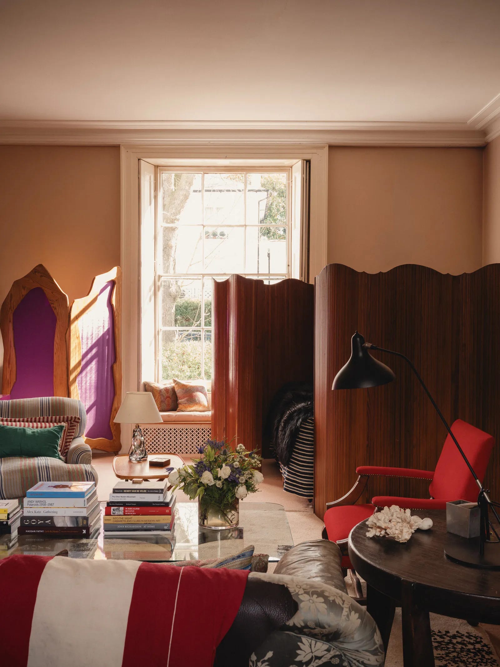
As Bray explains: ‘Old furniture has always been at the heart of the decorating work really. I understand that,’ he says. ‘And the rest of it is about catering to your basic human needs: a decent sound system, a big TV, no overhead lights but enough lamps to read by, comfortable chairs and storage. That’s basically “The Look.”'
Bray’s home is equal parts Bohemian and urbane, with piles of postcards, ephemera, and neckties complementing vintage Belgian room dividers, imposing oak dressers, and patterned textiles. I am drawn to the overwhelming ‘lived-in’ quality of Bray’s home, a place that feels deliberate in its decorative choices but entirely unfussy in execution.
A reminder that great antiques shouldn’t be an afterthought to our modern interiors, but rather the foundation upon which to build a home, and a life.
Go read the full article and watch the full video of Bray’s home here!
The home of Swedish artists Carl and Karin Larsson
Yet another Instagram reel discovery. I know I know, maybe I need to get the hell off my phone. But then what would I write about in these roundups??? It’s a dilemma…
Anyways, this reel explored the home of Swedish artists Carl and Karin Larsson whose hand-embellished house “stands as an homage to their vivid aesthetic, which paved the way for the patterns of the Finnish textile company Marimekko and the whimsical fabrics of the Austrian-born architect Josef Frank.”

“In 1888, the Swedish painter Carl Larsson and his wife, Karin, were given a remote log cottage in the village of Sundborn, 140 miles north of Stockholm, by her father. Over three decades, the couple transformed the house, which they named Lilla Hyttnäs, into an elaborate meta-art project, a hand-embellished 14-room home for their eight children.
Carl depicted them in more than a hundred Arts and Crafts-inflected watercolors, gamboling amid wildflowers and curled up in Gustavian chairs in rooms painted and stenciled in shades of ocher, crimson and teal. His paintings, which he published reproductions of in books translated into eight languages — “Ett Hem” (“A Home,” 1899) and “Das Haus in der Sonne” (“The House in the Sun,” 1909) — helped form Sweden’s national identity and imprinted on the world an indelible image of rural Nordic wholesomeness.”
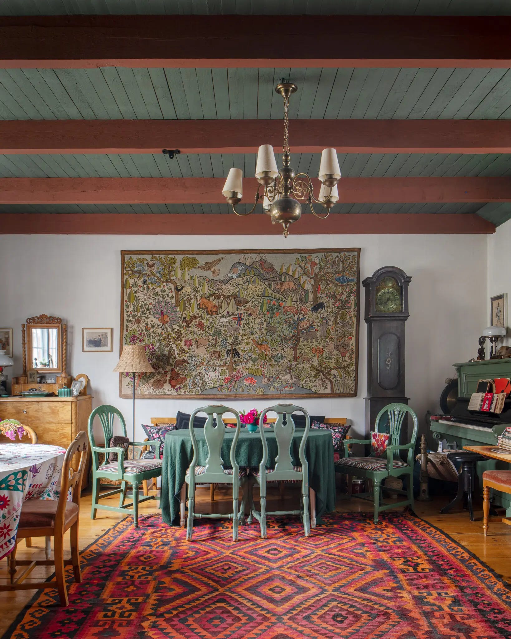
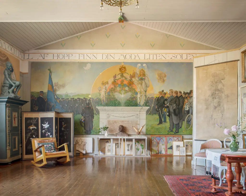
An indelible image of rural Nordic wholesomeness is exactly the summary for the Larssons’ home. A kaleidoscope of colours, textures, and light, the home is a perfectly-preserved capsule of the artistic practice and personal sensibilities of the couple.
These sensibilities most notably included a blatant disregard for the traditional organisation of living spaces:
“Influenced by the politically radical British textile designer William Morris and the Victorian art critic John Ruskin, who preached the democratization of design and the elevation of the handmade over the mass-produced, they decided there would be no central parlor for entertaining, no grand entrance or servants’ wings at Lilla Hyttnäs (or at the other homes they would go on to transform); instead, narrow corridors hung gallery style with framed drawings lead to lofty expanses and clusters of jewel-box rooms. In violation of the bourgeois norms of the time, the couple painted antique furniture with their characteristic disregard for provenance.”
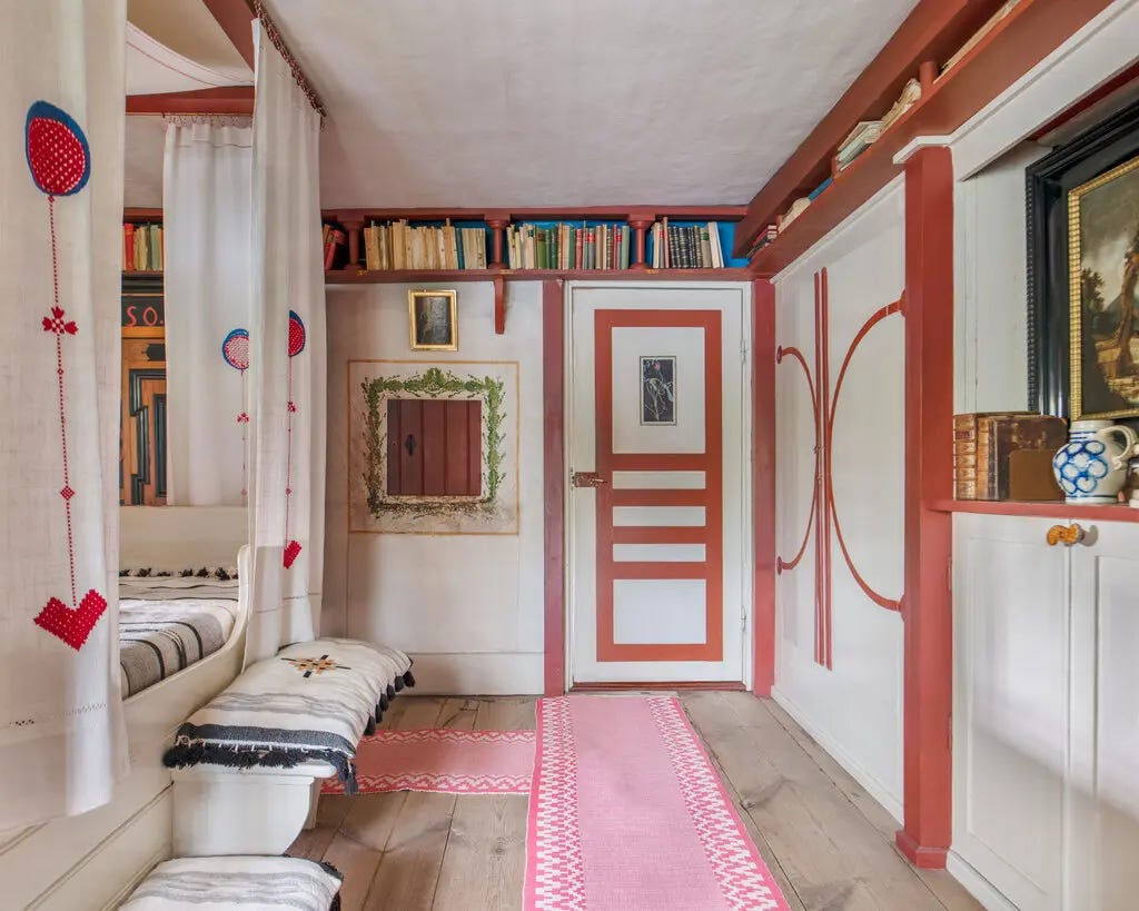
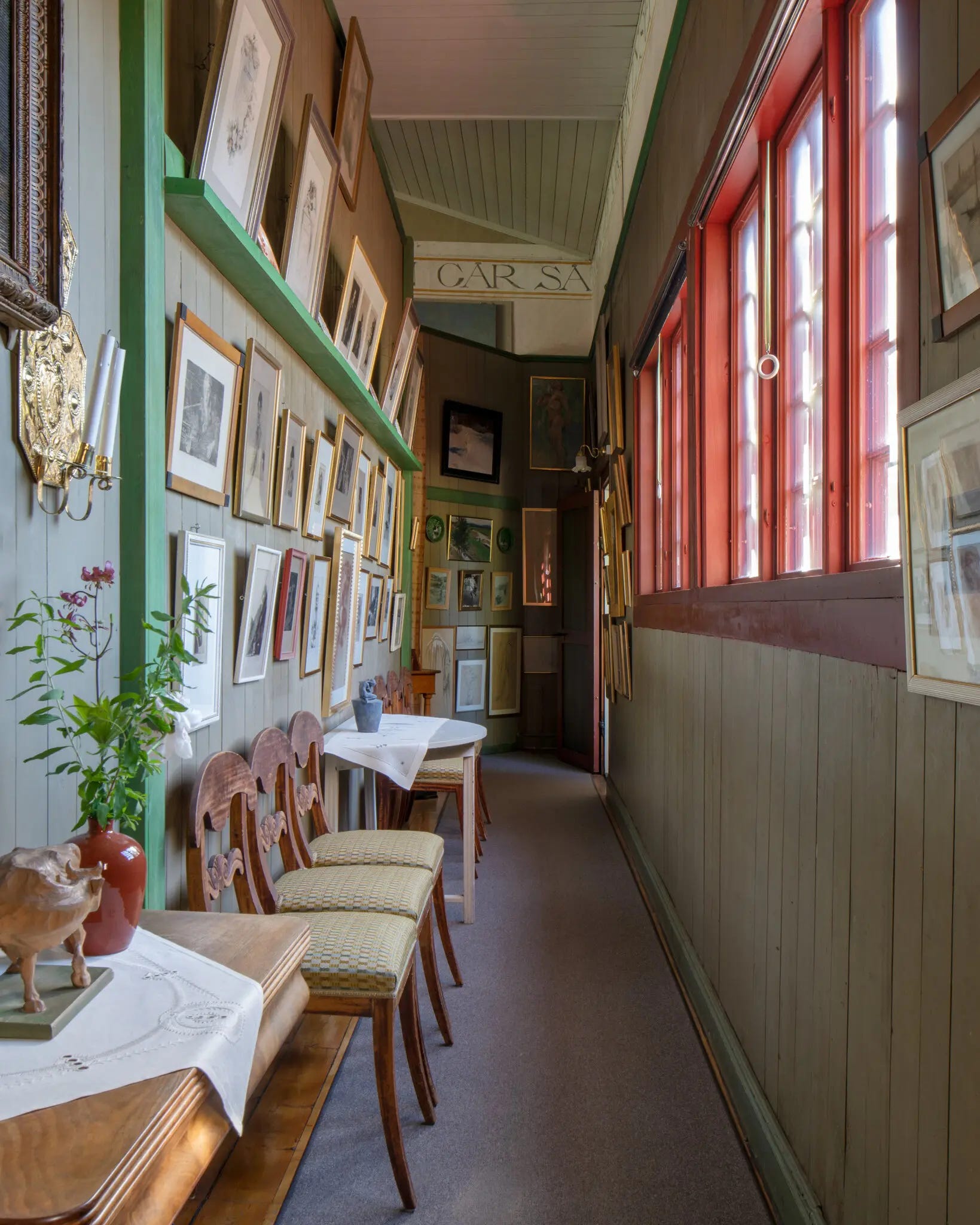
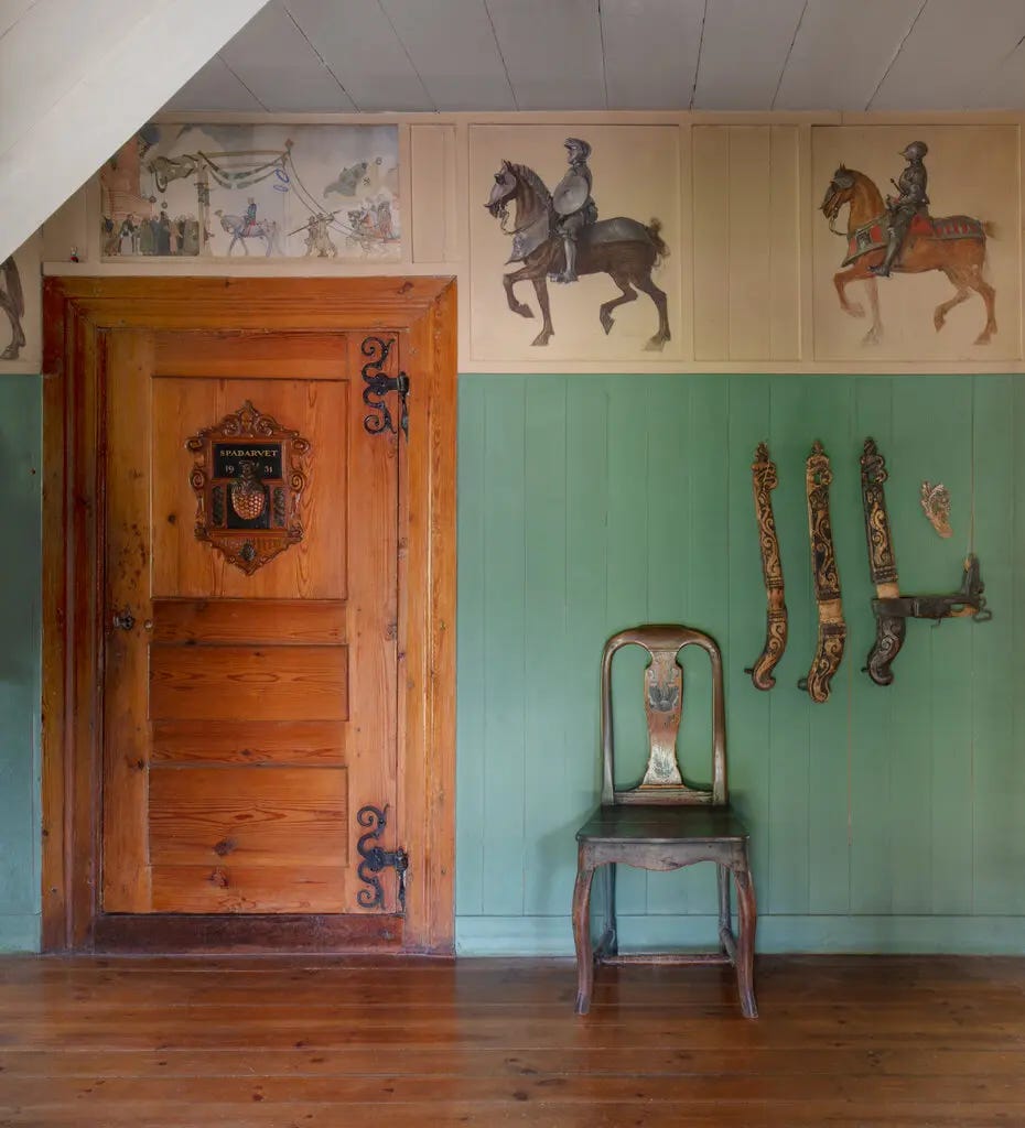
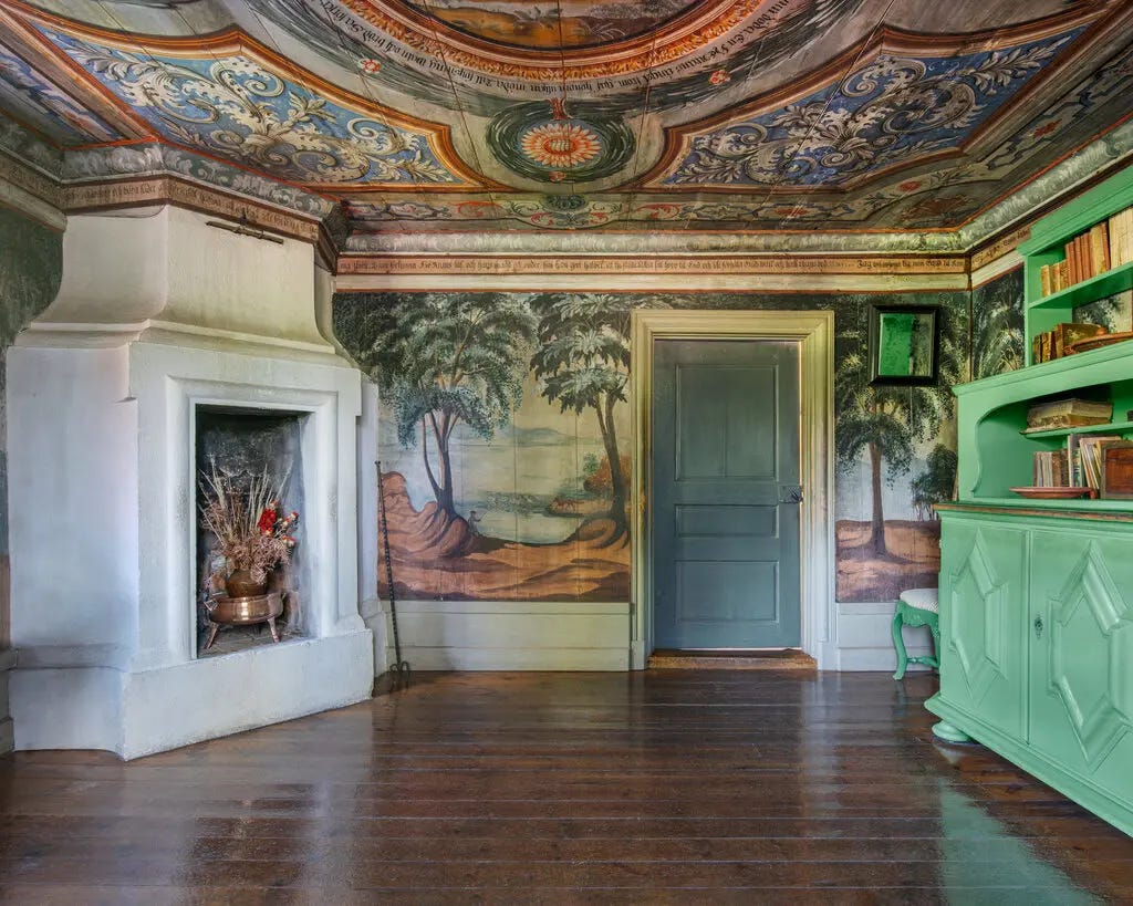
These jewel-box rooms explode with colour, character, and an inescapable sense of whimsy. Both extravagant and deeply personal, the Larssons' home reflects the essence of the couple’s art, which often focused on domestic or outdoor scenes filled with light, colour and joy.
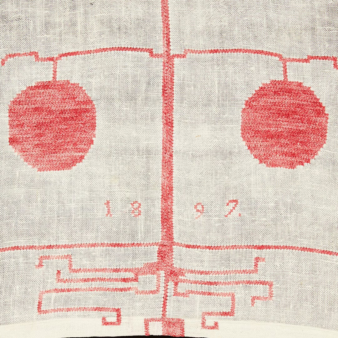
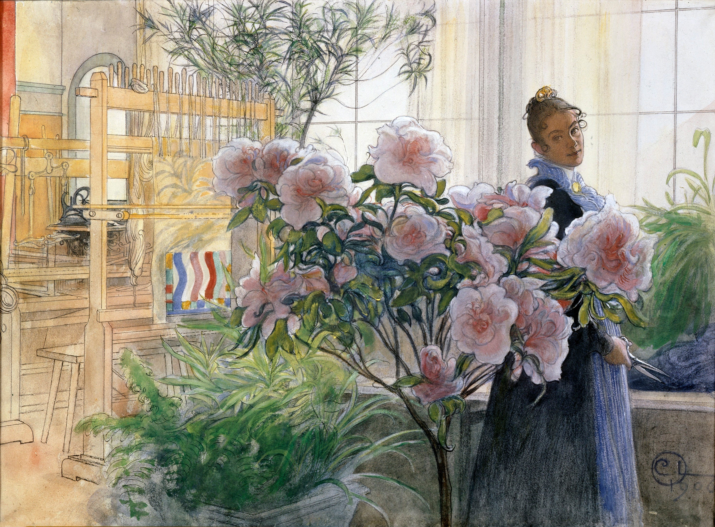
Perhaps even more interestingly, the Larssons’ home and art were also intertwined quite literally with Carl capturing the family’s home and, consequently, his and Karin’s art in many of his paintings. In the below painting, Carl has painted a breakfast scene featuring Karin’s hand-embroidered table runner which did indeed adorn the family’s dining table.

The Larssons’ home is overwhelming in its beauty and I think reflects contemporary tastes as trends move away from minimalism and towards a studied kind of colour-drenched, antiques-filled maximalism. Just look at Adam Bray’s home above!
You can read the full NYT article without a subscription here!
Finally - a collection of guest artist-drawn Mouton Rothschild wine labels
I came across this astonishing collection of wine labels thanks to one of my favourite art accounts on Instagram, Gohar World. Created by renowned chef and experimental food creative Laila Gohar, Gohar World is a “tableware universe that embraces craft, time, and tradition. Created in family-owned ateliers to bring people together around the table.”
Both Laila and Gohar World are exquisite Instagram follows, with Laila sharing her immersive food displays and Gohar World posting not only their own kitchen offerings, but bitse-size bits of design and food history.
Which is what brings us to the Château Rothschild wine labels.

Château Mouton Rothschild is a legendary winemaker in the Médoc region of Bordeaux. Back in 1860, winemaking was a collaborative effort between the château and the merchant. The wine traders were always the ones who designed and applied the paper labels, until this château decided to do it on their own.
The first artist that the château commissioned a wine label from was Jean Carlu, the artist credited for introducing Cubism to advertising. It was the first time that artwork was placed commercially on a wine label.
Today, the château boasts a collection of artwork slash wine labels by the likes of Georges Braque, Pablo Picasso, Marc Chagall, Vassili Kandinsky, and more— over the period of a century. A true celebration of the relationship between wine and art.


The labels are stunning, their hand-drawn quality eliciting a tangible connection with the artist’s brush- or pen-strokes. That tangible quality is interesting when you consider the way to view the art interacts with a viewer - the viewer in this case is the wine drinker who both handles and views the art as they select, open, and enjoy the bottle of wine itself. Personal art for a personal experience.
The tradition is still ongoing, with the Chateau Mouton Rothschild commissioning a contemporary artist each year to design a label. You can view the full archive of labels on their website with a write-up about each year’s artists and their personal explanation of what inspired their label.

That’s it for this week! ꩜꩜꩜Avery
This was amazing! Thank you for sharing this work.. I've been so deeply interested in glassware and Dimas work immediately drew me in. So excited to jump into this publication!
🙌🏼