


Weekly Design Roundup – The White Lotus opening sequence, British modernism in Hampstead Heath, and chantilly-scented candles
🌀🌀🌀 Chatting about finding delightful morsels of inspiration in your everyday routines


Welcome back to my ⋆ .𖥔˚Weekly Design Roundup˚𖥔. ⋆
꩜꩜꩜ This email is likely too long to read in your inbox - open the post in a web browser to read the entire thing!
A slower week on the design-scouting side, meaning real life was a bit busier. Watched some rugby, went on some windswept walks, ran along the seafront, ate good food - all generally aided and encouraged by the stunning week of weather that lasted until Sunday.
That first proper taste of spring (or summer dare I say?) is torturous when you live in London. Suddenly the city feels like the best place on earth, inspiring you de nouveau to suck every last drop out of the day. I personally tend to start writing extraordinarily long lists of places I have yet to visit, parks I would like to go run in, bakeries I absolutely must try, pubs that have been thoroughly recommended by friends of friends of friends. You get the idea.
Perhaps the theme of this week is discovering pieces of design inspiration closer to home. Quite literally – stumbling on an incredible privately-owned modernist building that happens to be right here in London. As well as more metaphorically – delving a bit more deeply into the design of a show that I already sit down to watch each week.
I think these types of recommendation lists can often feel like an Intro to Aesthetic Theory syllabus, requiring you to learn about a entire cultural historiography hagiography before being able to actually enjoy or understand the thing being recommended.
What I was reminded this week was that there are likely many, many interesting design threads waiting to be pulled in your existing routines. Books, tv shows, clothing, candles, Instagram feeds, friends’ posts, your local neighbourhoods - the physical and digital spaces where we live our lives are filled with compelling design stories.
What I’m trying to say is design! is! everywhere! design! is! everything! Be curious about easy things, not just the esoteric.
True to that sentiment let’s start with The White Lotus

I am sure we have all been riding the White Lotus wave these past weeks, and one of the most striking and compelling pieces of storytelling that has become emblematic of the TV show is their opening credit sequences.
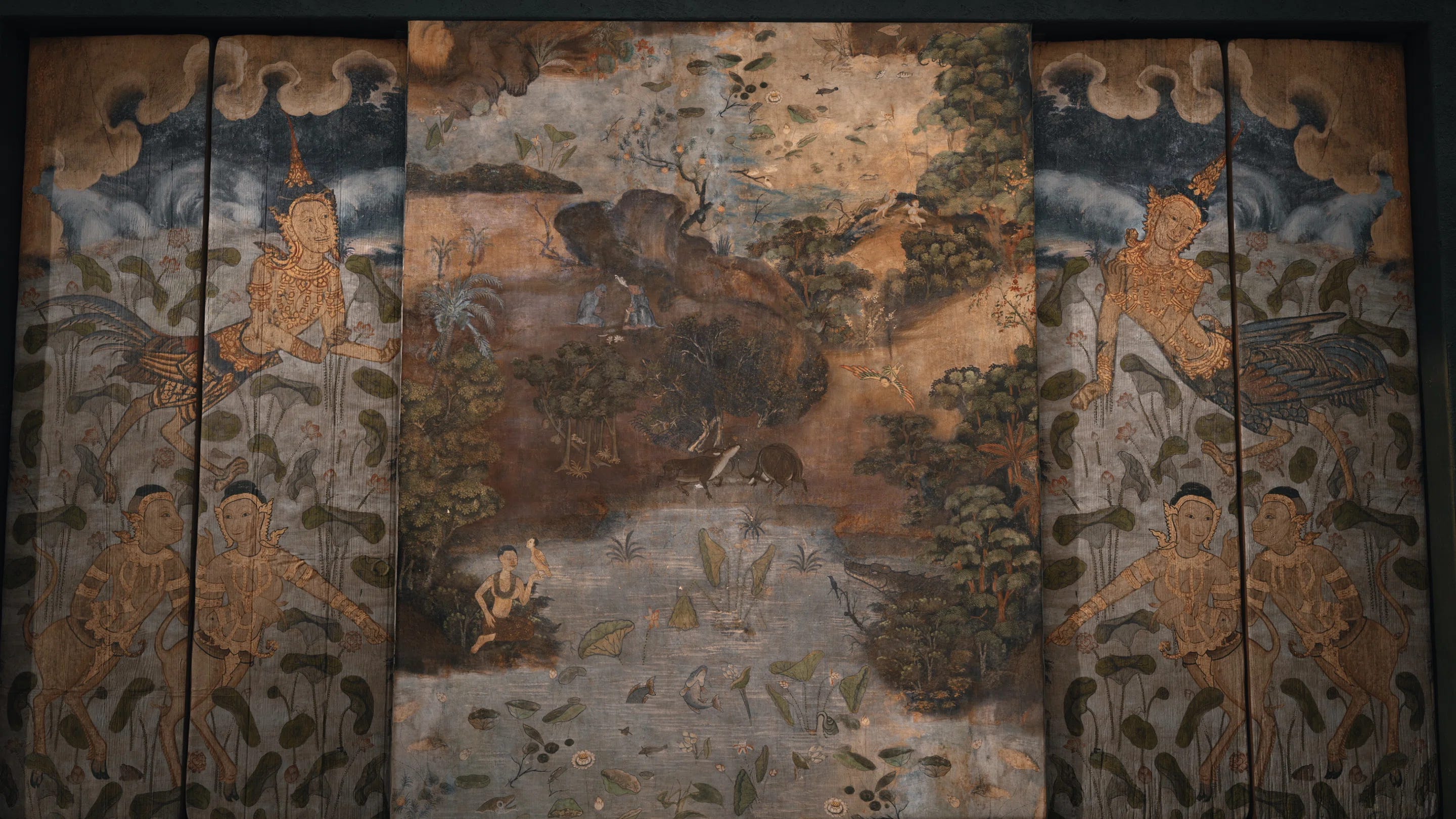
The first season, set in a luxury Hawaiian hotel, opens with an easter-egg filled sequence that features a series of patterned wallpapers within which bits of the season’s stories are hidden. Throughout the sequence the wallpaper slowly decays, mould spreading across the tropical scenes, hinting “at the hidden rot in paradise; the colonisation in Hawaii as an element ‘papered-over’. Those frames communicated very simply and powerfully what the show was about at its core.”
That quote is from a brilliant interview with the creative studio behind all of the White Lotus’ opening sequences, the Seattle-based Plains of Yonder. Published by one of my favourite design publications, It’s Nice That, the interview delves into the creative process behind the ideation and creation of the now-iconic opening credits.

I loved learning about the inspiration and design process involved in this season’s Thai-themed intro. As the design team explains, “For season three, as a starting material we used ornate paintings on the interior walls of Thai temples. We researched and captured stills from three Bangkok temples. From there, virtually every image in the sequence was re-combined; a collage with other bits to form new tableaux.”


This tableaux is one example of the richness of this season’s aesthetic - and has made me want to learn more about Thai design traditions. Ideally in situ if possible.
Café Verlet x Diptyque collaboration
Like any good Londoner, I love Diptyque candles. And their newest collaboration with the iconic Parisian café Verlet is dangerously delectable.
Café Verlet is a Paris staple that have been serving luxury coffee and tea since 1880. A small history from their website explains:
“Verlet has been importing and roasting the best Arabica coffees from around the world since 1880. When he returned from travels in Latin and Central America in the 1920s, Auguste Verlet created the legendary blends « Haute Mer » and « Grand Pavois », both of which are still available today. In the 1960s Pierre Verlet pioneered the roasting of single origin rare vintages.”
Beyond coffee and tea, Verlet is equally known for is their incredible array of candied fruits that adorn the windows of their storefront and tempt unsuspecting passerbys.
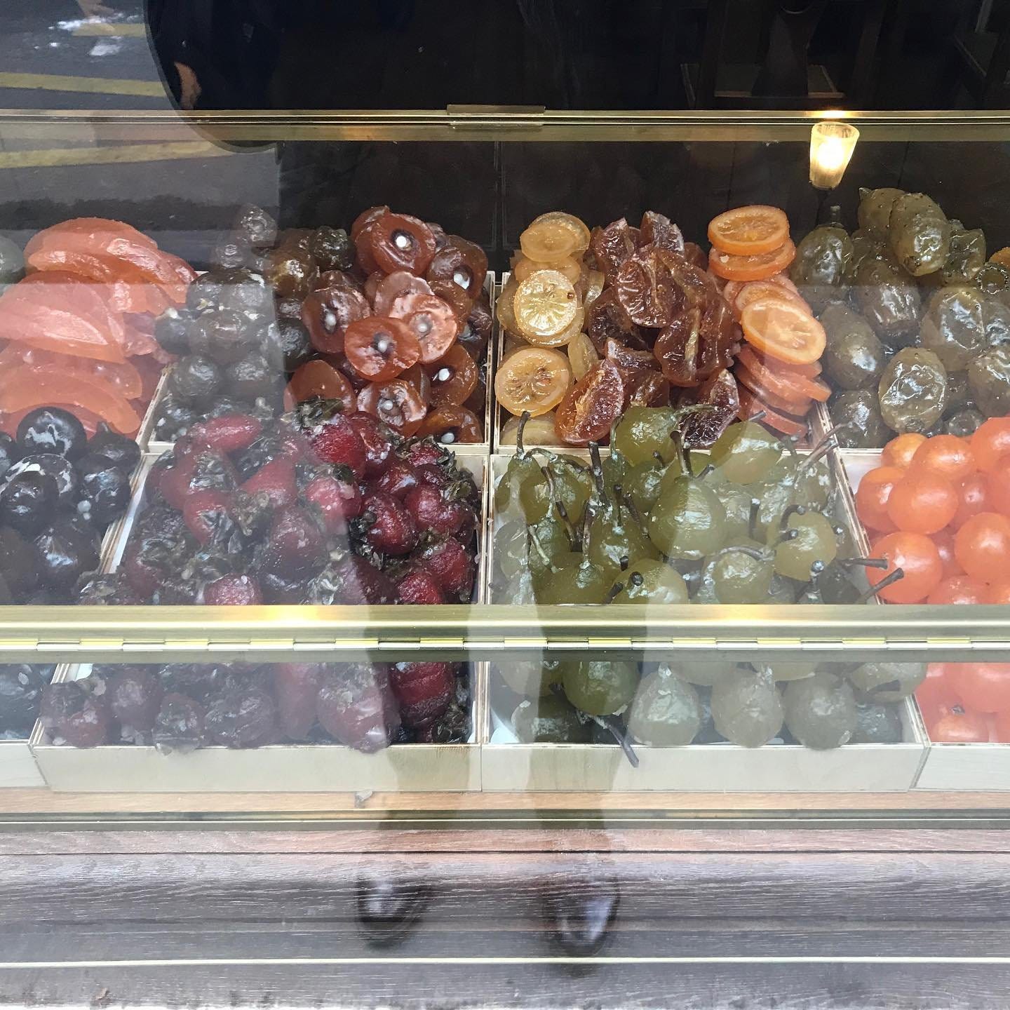
Both coffee and candied fruits are options in the café’s collaboration with Diptype: Café (Coffee), Biscuit, Chantilly, and Fruits Confits (Candied Fruit) are all on offer.
Beyond the thought of lighting a Chantilly-scented candle in my own home, I have loved the whimsical design world that the two brands have created to market their collaboration. From Wes Anderson-eque video shorts to a in-person London cafe pop-up, I really wouldn’t mind moving into Diptyque’s Parisian café and staying for awhile.
8 Holland Street

As if I didn’t already follow enough design accounts on Instagram, I have recently discovered the impeccably curated feed from the gallery and design studio 8 Holland Street.
Founded by Tobias Vernon and based in both London and Bath, Eight Holland Street is a gallery and design studio with bespoke services in art & furniture sourcing, curation and interior design. One of their locations doubles as a guest house for overnight stays, while all of their spaces host exhibitions (both vintage and contemporary), talks, and special events.
Their Instagram feed is so compelling as it reflects the interdisciplinary nature of the studio itself.
One post may be a snapshot of an upcoming exhibition, one a bite-size architectural history tour, and the next a detail from a painting you’ve never seen before. It’s the mix of careful curation and simple enthusiasm that sucks you in.


I would highly recommend giving them a follow - or visiting one of their current exhibitions at the South Kensington studio location.
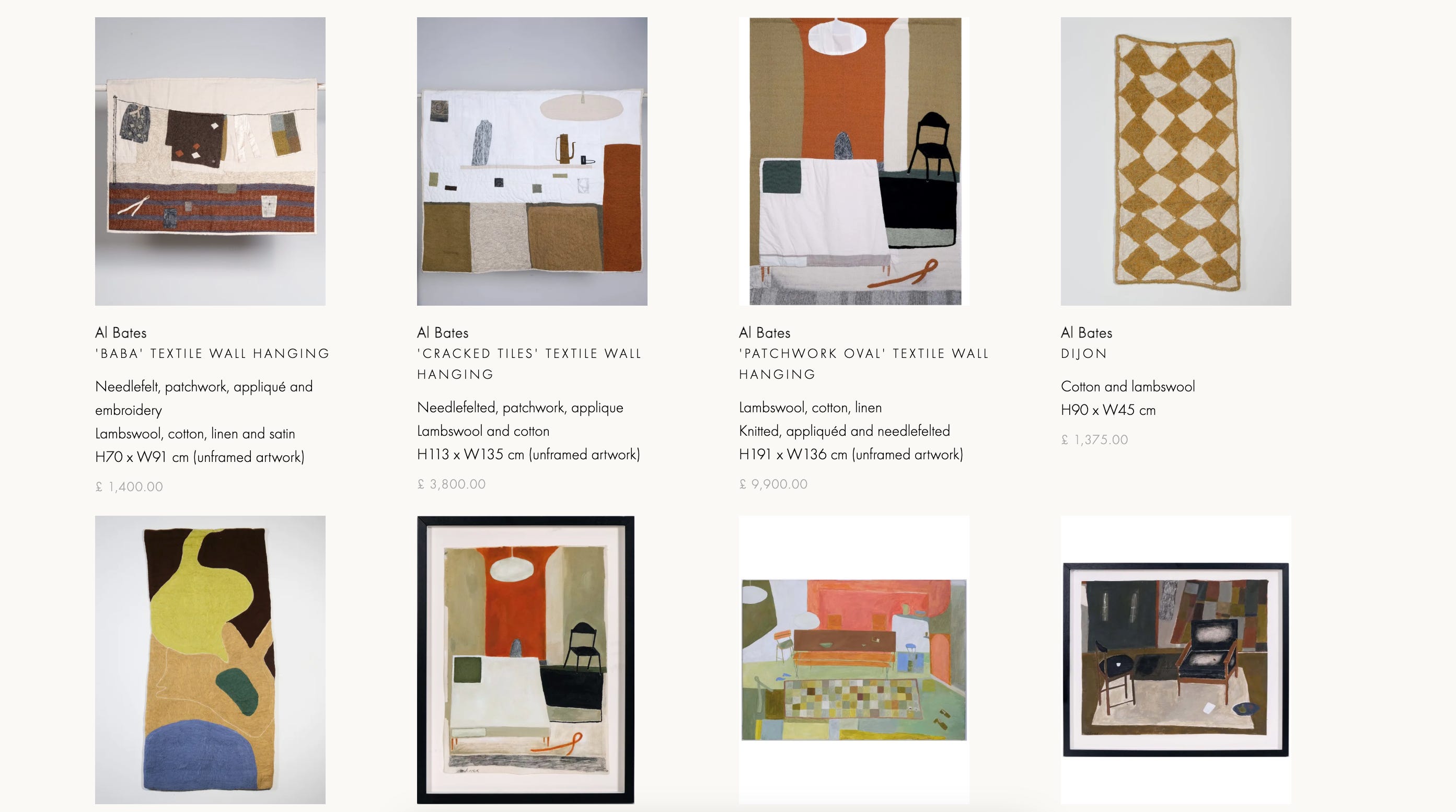
I am most definitely going to go see Al Bates: Elbow Room (on until May 24), if only to encourage my personal obsession with chairs:
“The exhibition presents a collection of textile works and paintings that examine the relationship between materiality, memory and space […] The works depict familiar objets - chairs, tables and textiles - subtly distorted to evoke a sense of place that is both intimate and abstract. Chairs, in particular hold a recurring presence in Bates’ work - a nod to mid-century designers such as Hans Wegner and Kaare Klint. Through her surreal, slightly wonky renderings, Bates evokes the fragile balance between familiarity and unease, comfort and restraint.”
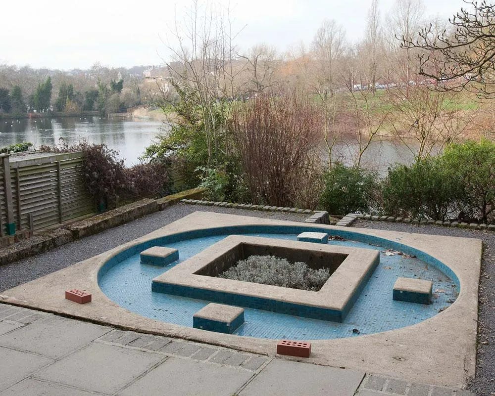
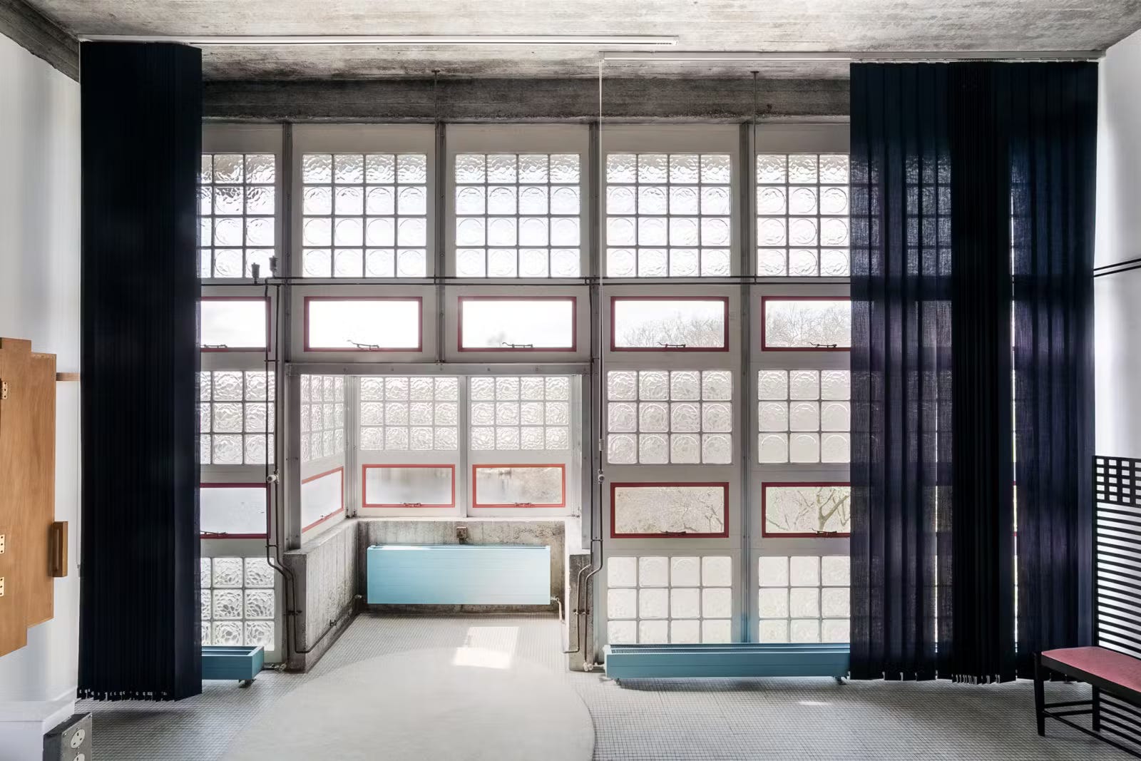
Brian Housden’s modernism Hampstead Heath home
One of my favourite modernist architecture accounts of all-time is Adam Štěch’s okolo_architecture.
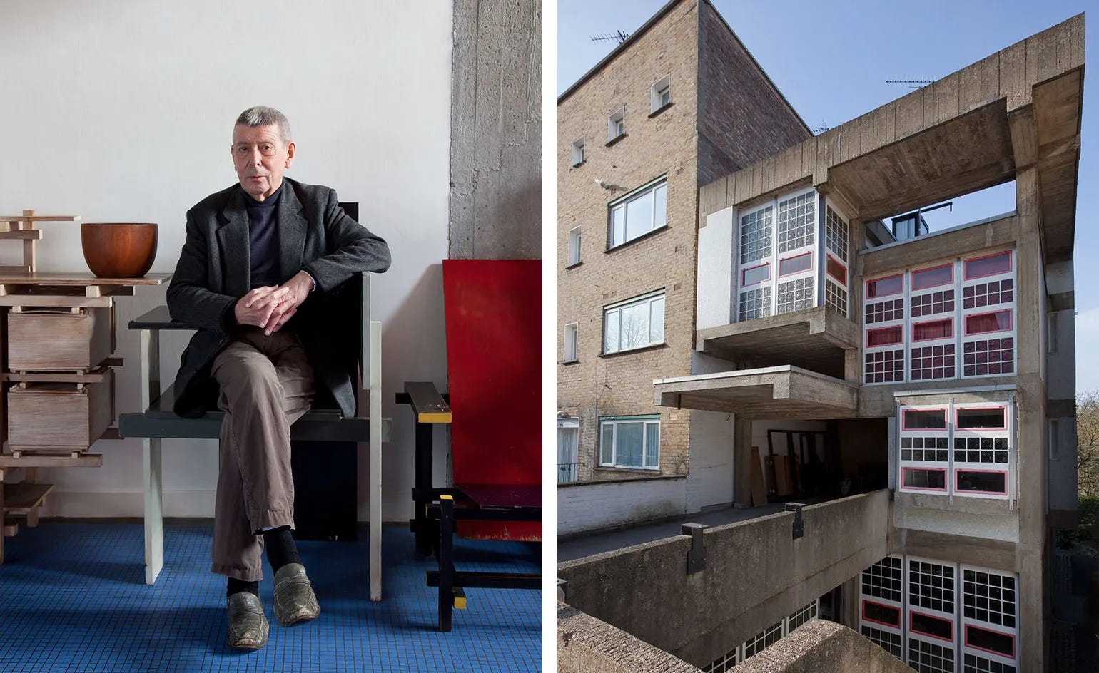
Recently, Adam did a short reel with brutalist.london where he mentioned that his favourite brutalist building of all time was the architect’s Brian Housden’s Hampstead home in London.

I was, of course, shocked and appalled to have never heard of this home despite my brutalist inclinations and my living in London. I immediately went on a Brian Housden deep-dive, learning that his private home - designed in the 1950s and inspired by Dutch De Stijl master Gerrit Rietveld - was one of Britain’s first brutalist dwellings.
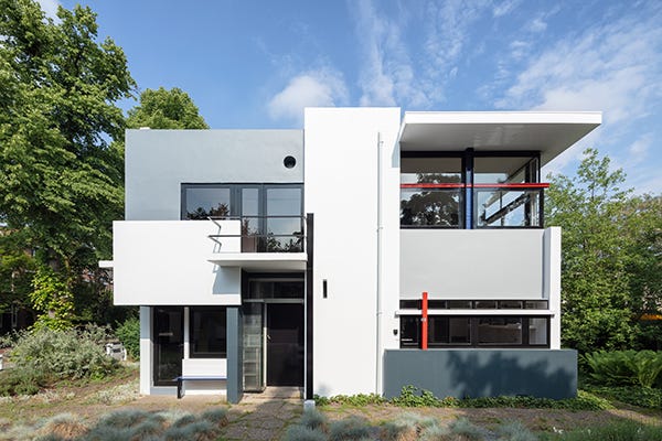
Housden’s house sits within the modernist haven that was post-war Hampstead, where avant-garde architects like Ernö Goldfinger, architect of the Trellick Tower, experimented in designing their own personal homes. Interestingly, while Godlfinger’s home modernises the Georgian terraced houses that surround it, Housden’s stands firmly on brutalist grounds.
I could discuss a myriad of details about Housden’s astonishingly innovative and carefully playful home - if interested go read Wallpaper or The Modern House’s articles - but what I want to pull out in the deliberate classical references dotted throughout Housden’s starkly modern masterpiece.
Starting with the exterior - the pull-handle on the front door of the home is apparently inscribed with a quote from Heraclitus, in Ancient Greek, “about the world being a unity of diversity, about simultaneously everything agreeing and disagreeing (it’s a long handle).” The quote is manifested in the home itself where light and air are constantly at odds with weight and raw material.
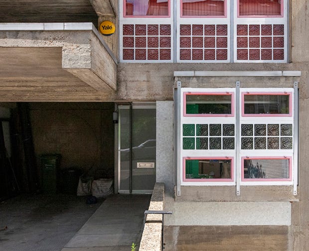
I have yet to pin down the exact Heraclitus quote so some in-person field research may be necessary - stay tuned for any breaking developments. And if you fancy a bit more Heraclitus (“one cannot step into the same river twice” and all that) this blog article is a great summary of his philosophies.
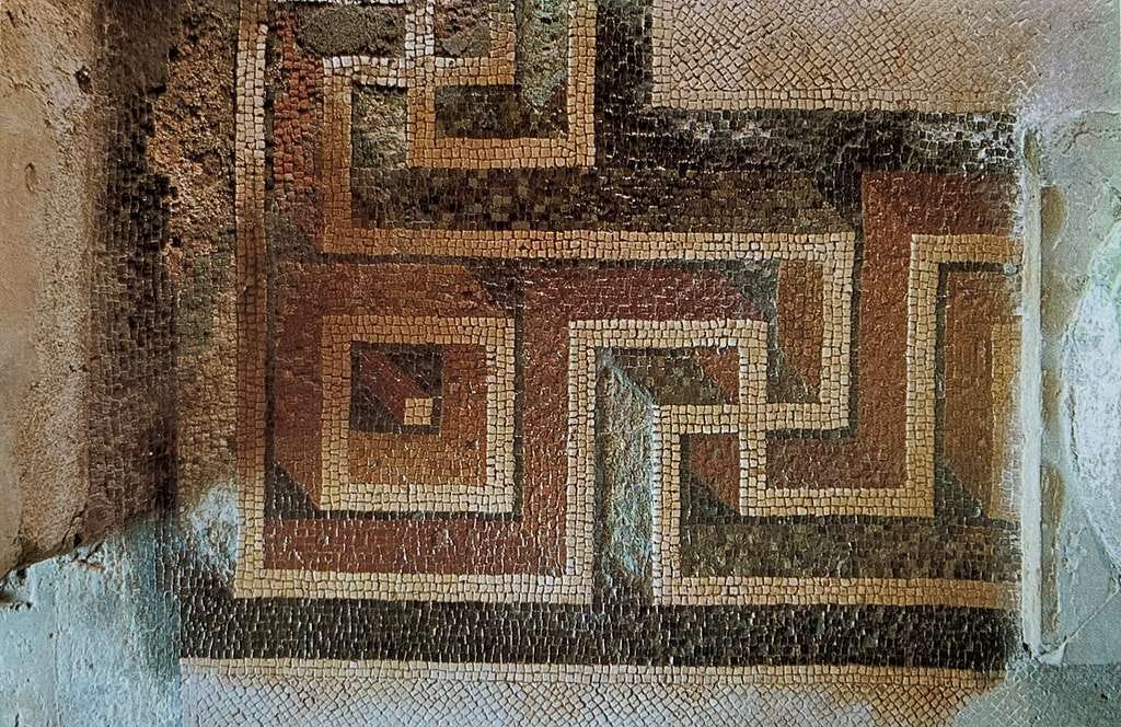
Another nod the classical world is the threshold to the home, where a single Greek meander - or decorative border - “wraps around itself in what is surely a reference to the waves of Roman floor mosaics, the level floor as a metaphor for the waters of chaos being calmed by habitation.”
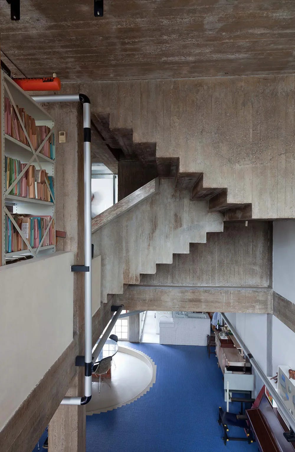
Finally, there are many, many examples of large circles build into the interior and architecture of Housden’s home which Housden himself identified as mandalas. There’s one over the carport, over his desk, another over the dining area and one built into the garden architecture, to name a few.
They are an interesting contrast to the brutalist setting, echoing the ancient and the occult rather than the futurism or utopianism that often defined modernist design. However, modernism itself has its roots in the occult - a wild discussion for another day - making Housden’s mandalas feel subtly well suited to a space attempting to reflect a new, less traditional, more experimental world order.

That’s it for this week! ꩜꩜꩜Avery